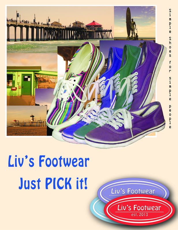
Liv's Footwear
September 5, 2013
Simple shoes for any time of the day. There are many different styles of these comfortable footwear. Liv’s Footwear is designed for any type of event, from a day
spent at the mall, to a dance party. The sleek design of the shoes make pairing
them with every event easy. The laces on the shoes only go up half way adding to the exciting shoe design. These low cost shoes are perfect for
those wanting to look cool without even trying Perfect for a day kicking back
with the boys, or a girls' night out. The options are endless when it
comes to these shoes. Buy these fun and hip shoes where footwear is sold.
|
|
|
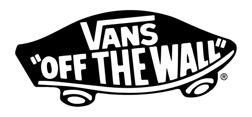
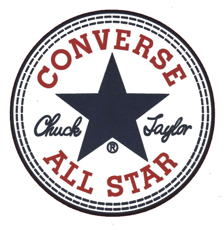
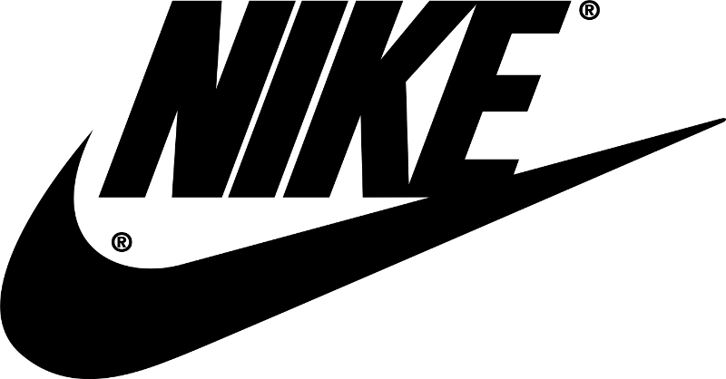
Three Examples of Logos
These three logos are some of my favorite shoe logos because they are simple and unique! The Vans logo is simple because it only has a slogan and the name of the company. Those two things are on a cartoon skateboard. Most people who own these shoes actually use them to skateboard. I think that this is really smart because it shows what their company is all about and who should be wearing them. I do not skate board, but I do own a couple of pairs because I think that they are very simple and cool. The Converse logo has a little more going on. I think that the two colours help to break the busyness of the two different fonts. This logo again just has the only things needed to show people what their company is about. The Nike logo is as simple as simple gets. This logo only contains the swoosh and their name. Many times you just see the swoosh by itself because everyone knows what that means. I like the fact that everyone knows what it is just by one symbol. The swoosh represents years of awesome shoes.
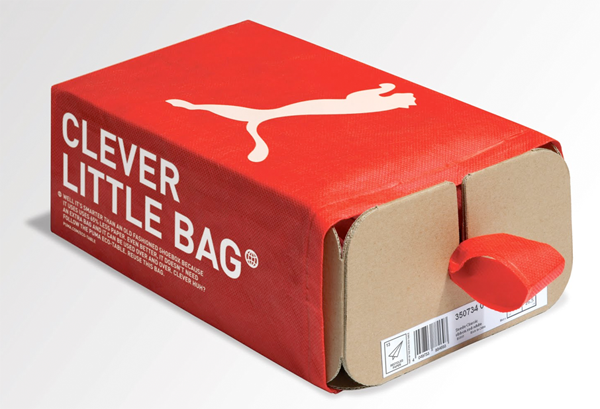
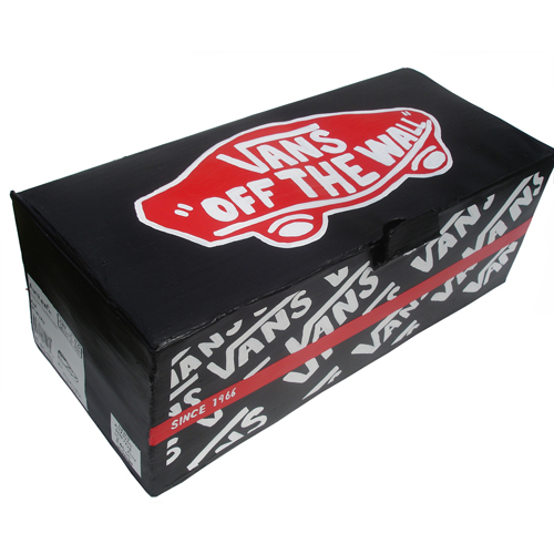
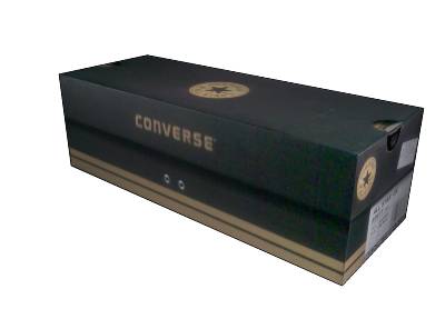
Three Examples of Packaging
Three Examples of Print Ads
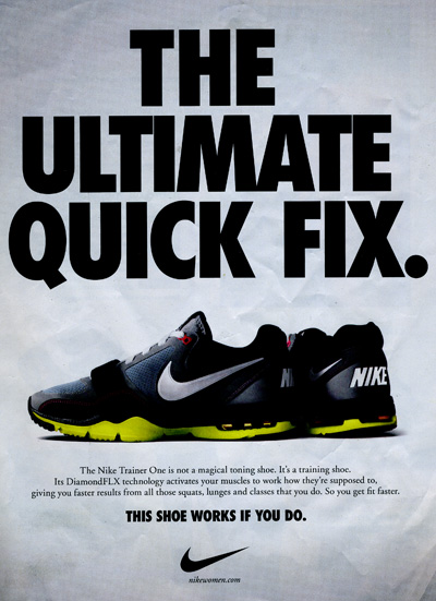
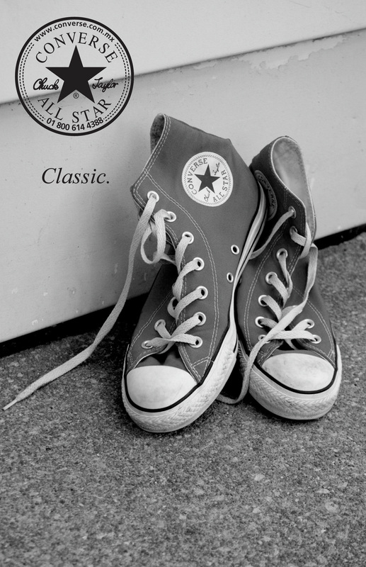
The first print ad that I have is one from Nike. This ad says, 'The ultimate quick fix, this shoe works if you do.' The ad itself is very plain, with different sized words on it. The background is also very plain, a dull like colour. The small print is very hard to read, especially on a computer. I don't really like that part of the ad. The second ad I have is one from Converse. I like this ad a lot. The fact that there is only one word on the ad, minus the logo, makes the image a little more appealing to the eye. I think that the word 'classic' is very powerful and it stays in your mind. The black and white photo on the converse also helps to add to the classic feel of this ad. I like that there is not a lot of reading on the ad so you can just focus on the picture. The next picture is an ad by Keds. This ad also has a very classic and old feel with the picture being in sepia. The shoes and her nail polish being the only things in colour ad an interesting twist on this ad. The nail polish colour matching the text colour and the logo on the shoe was smart marketing tool. The blurb about the product was very cute, with some of the things it said. I think that the text should have been bigger, so it would be easier to read. For my print ad I want it to be very simple and appealing to the eye.

Five Examples of T.V Commercials
The fist commercial ad that I found was for Converse
|
|
|
|
|
|
|
